
Customise how your widget looks
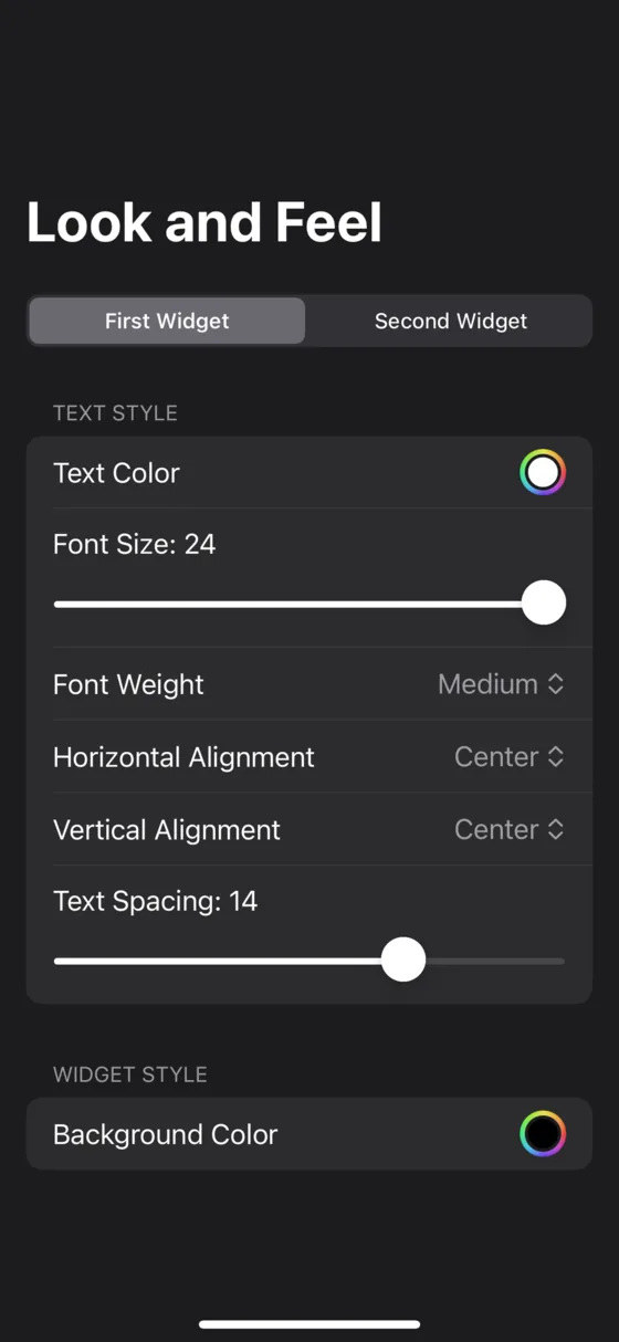
A Smile widget is text, so nearly everything about it can be changed: 19 typefaces, any size from 5 to 100, nine weights, any colour, nine alignments and adjustable spacing.
- You will end up with
- A widget that looks like yours
- Takes about
- 6 minutes
There is a live preview at the top of the customisation screen, so you can watch every change land without going out to the home screen and back.
Open the widget and find Look and Feel
Open Smile, choose the widget, and go to its appearance settings. Most of the controls sit behind an Advanced disclosure, so open that too if you want everything.
Start from a ready-made style
There is a carousel of presets at the top. Pick one that is close to what you want and adjust from there, rather than building from defaults. Changing any setting switches the style to Custom, which is expected.
Set the typeface, size and weight
Nineteen typefaces are built in: the system font, San Francisco, New York, Helvetica Neue, Arial, Avenir, Avenir Next, Baskerville, Copperplate, Courier, Futura, Georgia, Gill Sans, Menlo, Optima, Palatino, Times New Roman, Trebuchet MS and Verdana. Any font you have installed on your phone shows up under Installed Fonts.
Size runs from 5 to 100, and you can tap the number to type an exact value rather than fighting the slider. Weight has nine steps from ultralight to black.
A small widget with big text holds about three names. If your list is getting cut off, drop the size or use a larger widget rather than shrinking the text until it is unreadable.
Text case is separate from what you typed. Force lower case for a quieter list, or leave it as Original.
Choose colours, or follow the system theme
Set the text colour and background colour to anything. White on black is the default, and it is the default for a reason on an OLED screen, but nothing stops you.
Turn on Follow System Theme and you get two sets of colours, one for light mode and one for dark, switching with the phone. Otherwise pick Custom, Light or Dark and it stays put.
If you want the widget to disappear into your wallpaper rather than sit on a coloured block, the transparent background is a better tool than any colour here. Make a widget transparent.
Position the list
Horizontal alignment is leading, centre or trailing. Vertical is top, centre or bottom. Together that is a nine-point grid, so the list can sit in any corner of the widget rather than always in the middle.
Horizontal offset nudges it up to 100 points either way, for lining up against something else on your home screen. Text spacing opens the gap between rows, up to 20. A few points of extra spacing is the single change that makes a list feel calm rather than cramped.
Share one appearance across every widget
Styling ten widgets one at a time gets old. Set up Master Appearance once, then turn on Use Master Appearance on each widget that should follow it. Change the master later and they all move together.
If you only want to copy a look once rather than link them permanently, use Import Theme Style and pick the widget to copy from.
Making the list harder to use on purpose
Randomise app positions reshuffles the widget after every launch. You have to actually read the list instead of tapping the third row from muscle memory. It is a small thing that changes how often you open something without meaning to.
Starting over
Reset to Defaults puts a single widget's appearance back to how it shipped. It only affects that widget, and it cannot be undone.
Stuck on a step?
Someone in the Discord has almost certainly hit the same thing. It is the fastest way to get unstuck.